How do you design mobile forms and buttons for different screen sizes and orientations?
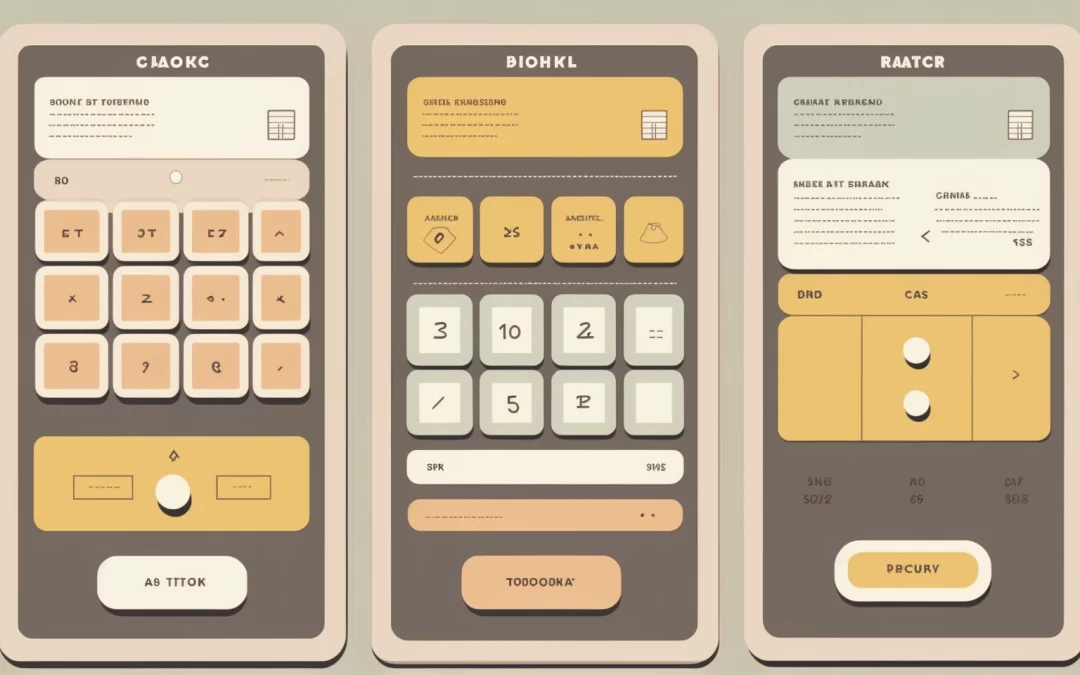
Designing mobile forms and buttons for different screen sizes and orientations involves following best practices and responsive design principles. Here are some key tips for creating mobile-friendly forms and buttons that adapt to various devices and orientations:
Use responsive design: Responsive design is crucial for creating forms and buttons that automatically adjust their layout, size, and appearance based on the device’s screen size and orientation. This ensures a consistent and user-friendly experience across different devices.
Prioritize simplicity and clarity: Keep your forms simple and uncluttered. Use clear, concise labels, and minimize the number of form fields to reduce cognitive load and make it easier for users to complete the form.
Optimize input types: Use the appropriate input types (e.g., text, email, number, date) for each form field, making it easier for users to input data and reducing the likelihood of errors. Utilize native controls provided by mobile devices, such as date pickers and numeric keyboards, to streamline data entry.
Provide clear and accessible buttons: Ensure that buttons are easily visible, have descriptive labels, and are large enough to be tapped easily on touchscreens. A minimum touch target size of 48×48 pixels is recommended by the W3C for mobile buttons.
Implement a flexible grid layout: Use a fluid grid layout that adjusts to different screen sizes and orientations. This will help maintain a clean and organized appearance while accommodating various device dimensions.
Use vertical stacking: On smaller screens or in portrait orientation, stack form fields, and buttons vertically to maximize readability and ease of use.
Group-related fields: Organize related form fields into logical groups using fieldsets and legends. This can help users quickly understand the structure and flow of the form, making it easier to complete.
Test across devices and orientations: Regularly test your forms and buttons on different devices and screen orientations to ensure they function and display correctly. This will help identify any issues and optimize the user experience.
By following these guidelines, you can design mobile forms and buttons that are accessible, user-friendly, and adaptable to different screen sizes and orientations, ensuring a seamless experience for users across various devices.